
Who doesn’t love that fresh autumnal feeling of summer waning, pumpkin spice erupting, and the smell of fresh school supplies? Probably lots of people. But I love it. And now that I’m not going to classes, I have to get my school supply job in a different way – stickers! The conference season is about to swing into the busy season of (Northern Hemisphere) fall, with a sprint between now and the end of AWS re:Invent. It’s time to order new stickers, use all that branding testing you did in the quiet quarter, and get your brand as many places as possible.
I just got a sticker sampler pack from my favorite sticker vendor, StickerApp. What follows is a picture essay of how I feel about their printing stocks, but you’re probably busy, so here’s the summary:
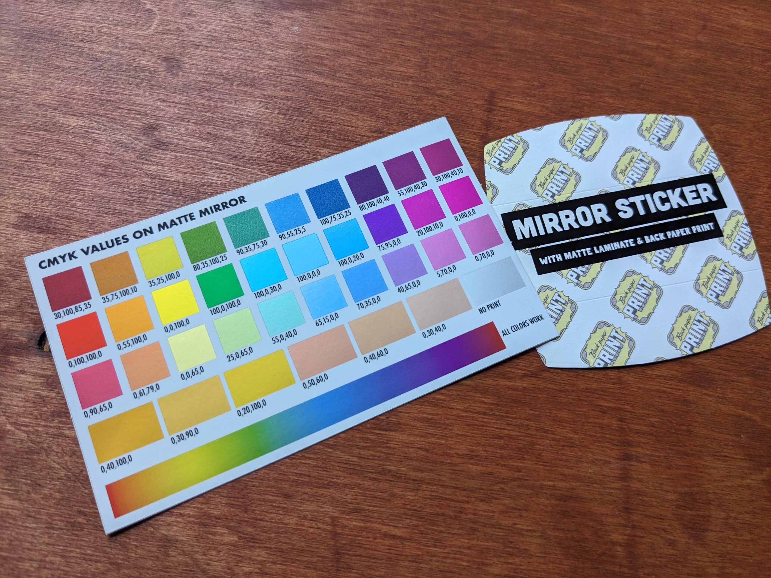
I have always been very satisfied with their product and their service. I think their most beautiful product right now is the matte mirrorball.

Click through for more analysis.
If stickers were easy to photograph, they wouldn’t mail me a sticker sample pack, but it’s probably worth while to at least show you what I’m talking about.

The matte finish tends to dim the holographic effect, which is probably why there isn’t a prismatic matte finish. The vinyl is less exciting than all the fancy options, but it’s also much more affordable, and you will get something high quality that doesn’t feel cheap or thin.

Kraft paper (also known as butcher paper or brown paper) is highly textured and tends to be associated with more earthy/wholesome/diy products. You’d use this stock if you wanted people to think of your brand as authentic and folksy.


I’m so excited that they’ve added this much finer/smaller glitter option. The bigger glitter tended to make it hard to read very fine details on small stickers because the glitter particle size was so large. That is at least partially a sticker design problem.

Back printing is such a game-changer. It gives you a chance to get secondary interaction from the sticker, not just branding. It’s like a business card or flyer, but now on something that people actually want to take and will keep.

This brushed alumunium looks great, and is not actually heavier or thicker than a standard high-quality vinyl sticker. Oh, wow. I just realized that this is a Taylor Swift-themed sticker.


One that I don’t have a picture for, but is available is glow-in-the-dark. I really wanted to design a LaunchDarkly sticker to take advantage of that effect, but I didn’t get around to it.
Another cool sticker is Calm Strips, which are restickable sensory-focused stickers.
Hope this helps!